Toddle
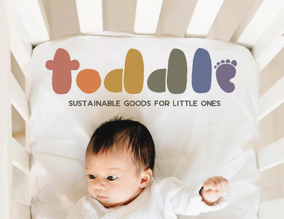
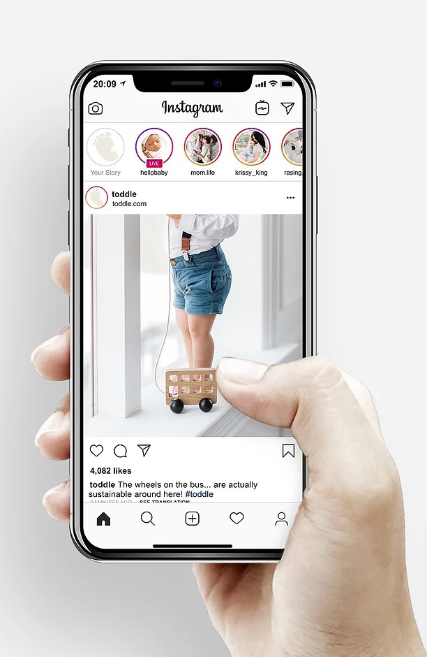
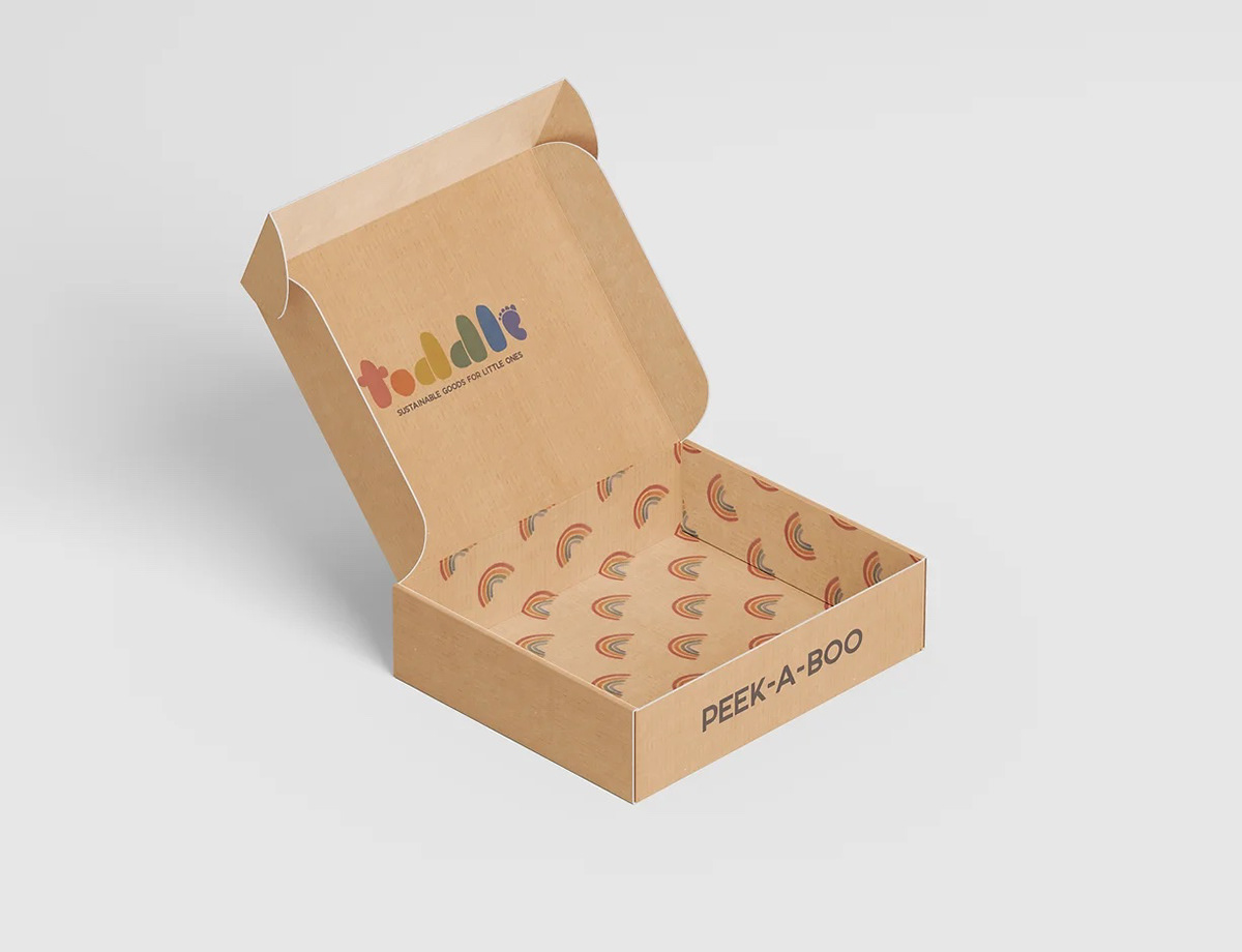
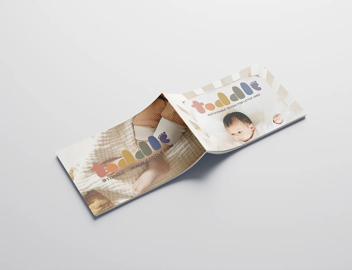
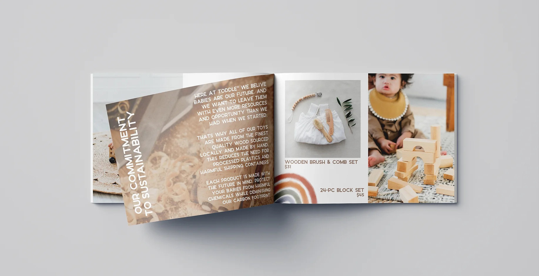
This was a proposal for an e-commerce packaging and brand design project, built around a baby and toddler lifestyle brand that is fully organic and sustainable. I wanted to convey a clean, child-like approach using muted colors of the rainbow and hand-drawn assets. The e-commerce branding includes a shipping box, tissue paper, and small organic burlap bags. I wanted to ensure all of the materials used follow the sustainable theme of the line.
Jaybird Wine
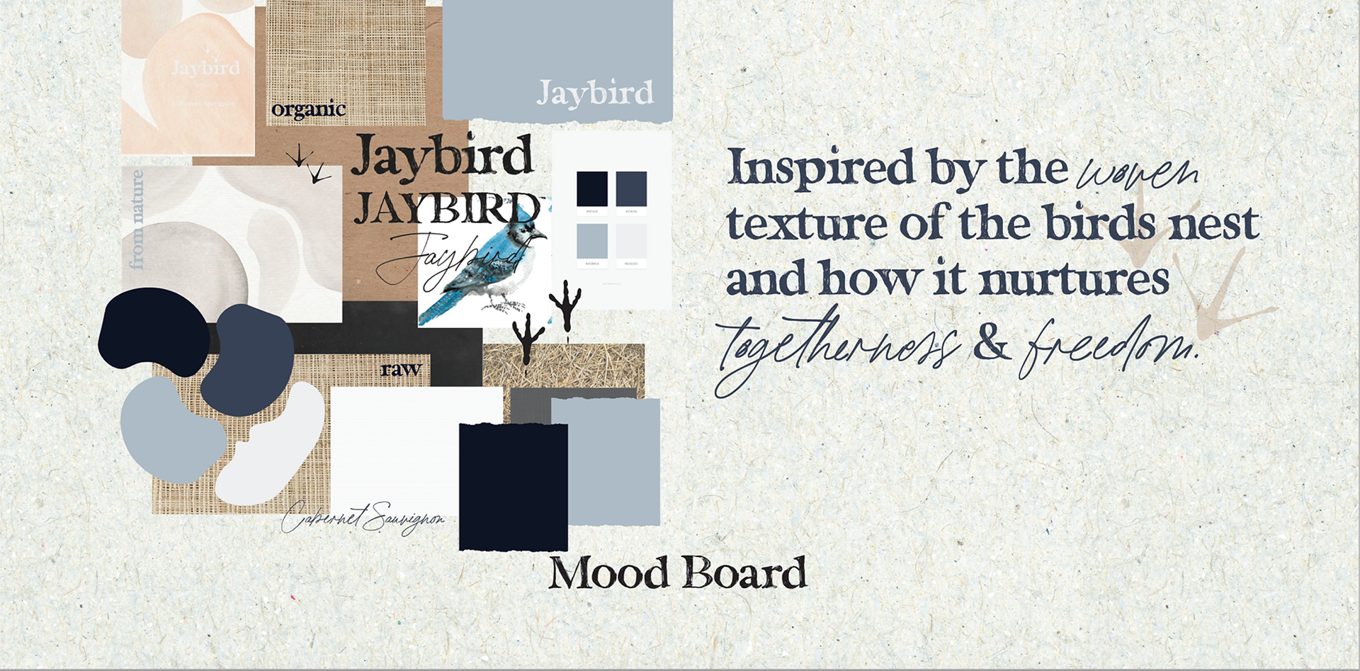
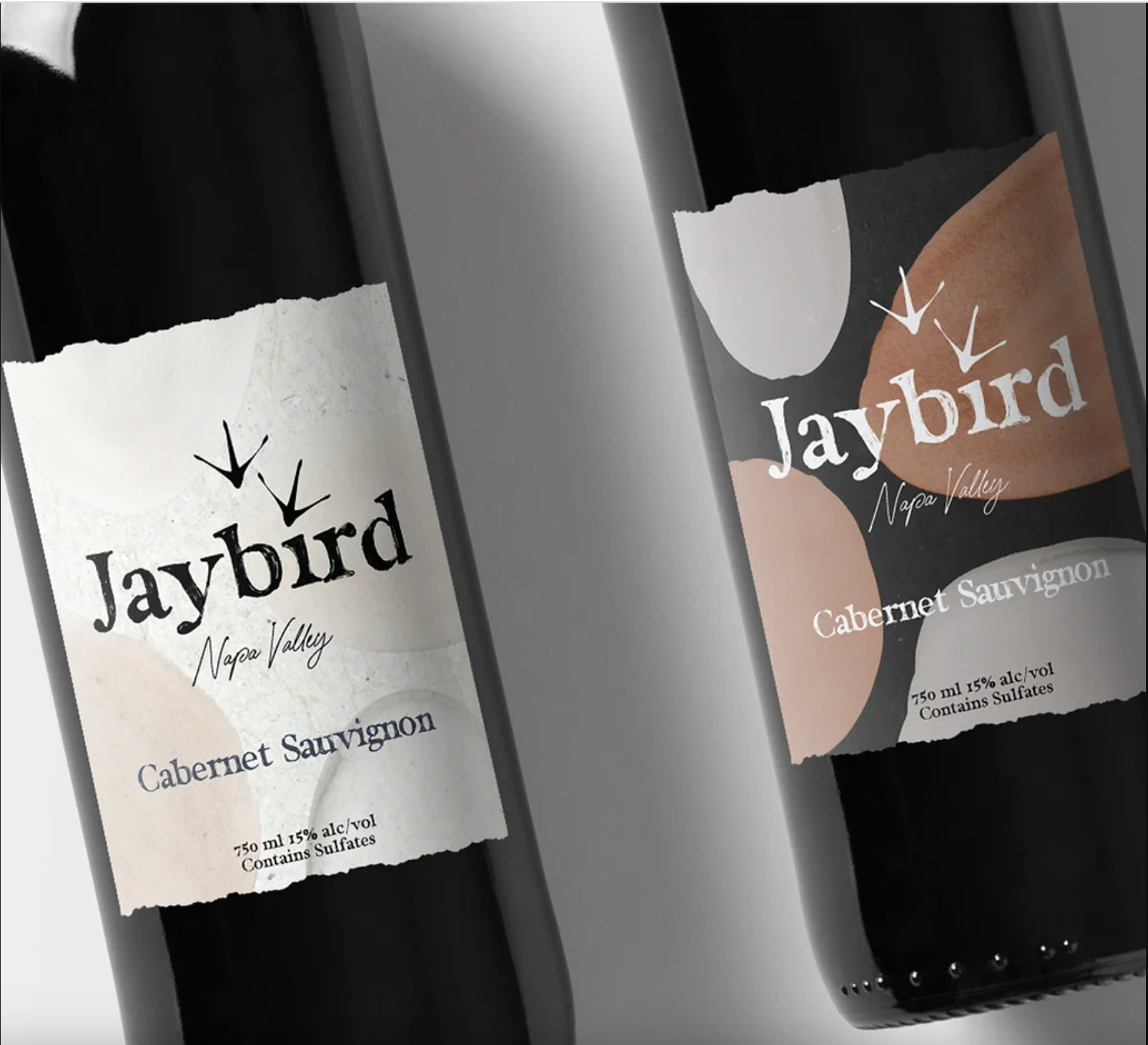
Jaybird Wine was a passion project in the midst of the pandemic lock down to keep me occupied and designing. I challenged myself to create and build a brand from the product up. I wanted to do a wine brand the carried two versions of a shared branding and identity. Almost like a brother and sister pairing. I built out the mood board and came up with a company mission statement to give the brand some real character.
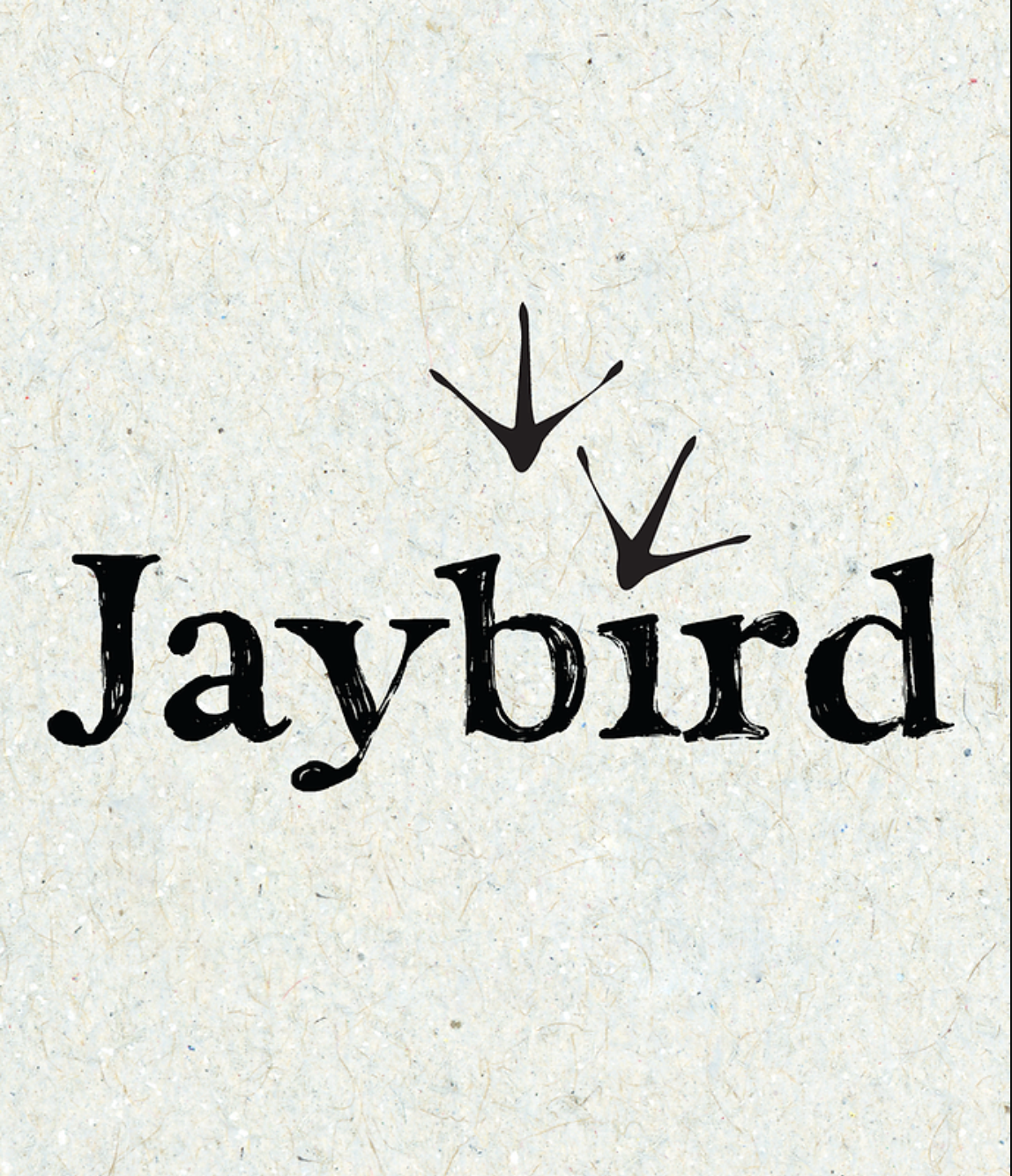
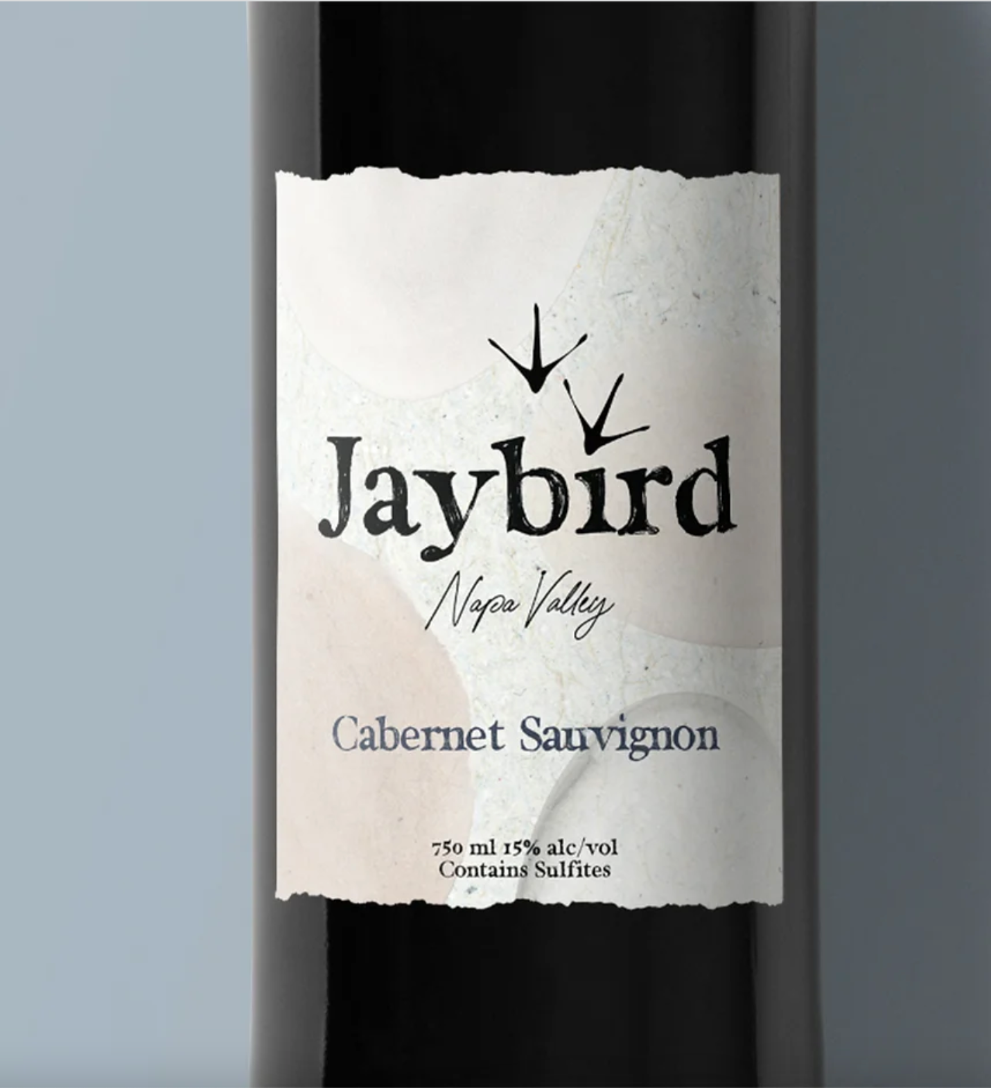
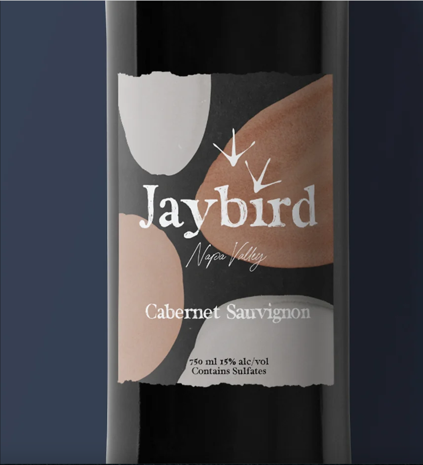
The idea was to represent how wine fosters togetherness and freedom, just as a grape from the vine does for a bird in that same vineyard. I used the shapes and contour of what looks like eggs in a nest for the label, underneath the logo. For the logo I used a hand scratched rustic font, and incorporated the foot pattern of an actual Jaybird.
The idea was to represent how wine fosters togetherness and freedom, just as a grape from the vine does for a bird in that same vineyard. I used the shapes and contour of what looks like eggs in a nest for the label, underneath the logo. For the logo I used a hand scratched rustic font, and incorporated the foot pattern of an actual Jaybird.
